The Sign That Lets a Shared Room Explain Itself
Shared room signs can help visitors find the right place, understand what belongs where, and join in without waiting for someone to explain.
At the door of a shared room, a visitor pauses with a stack of folding chairs and scans three handwritten notes. One says “Welcome,” another points vaguely toward the back, and the third is taped over an old label. Good shared room signs prevent this small uncertainty from becoming a request for help. Their job is not to decorate the wall. It is to make the room understandable at a glance.
Imagine a neighborhood association with a room used for meetings, craft afternoons, and drop-in help. The group has noticed that newcomers often stop at the entrance to ask where to put coats, which cupboard holds cups, and whether a table is reserved. In this invented situation, members decide to give the room one visual language, so visitors can read its cues without knowing the regulars.
What should a visitor understand first?
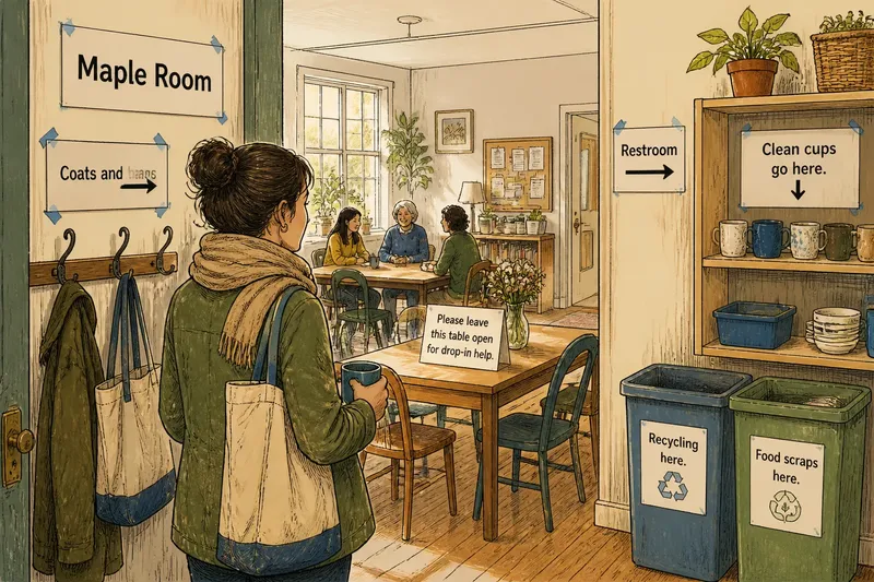
The group begins by standing at the entrance and asking what a person needs to know before taking another step. The first answer is the room’s identity: “Maple Room.” That name belongs near the doorway, where it confirms that someone has arrived at the right place. A room name should not compete with a long welcome message or a list of rules.
Next come directions that answer immediate questions. A simple arrow labeled “Coats and bags” points toward the hooks. Another says “Restroom” and indicates the corridor. The group avoids directions such as “over there” or “ask inside.” A visitor should not need to infer which side of the room the writer meant.
Then come short instructions for shared objects and routines. “Clean cups go here” belongs on the open shelf, not on the opposite wall. “Please leave this table clear” should sit at the table’s edge, where the request makes sense. A message is easiest to use when it appears at the point where someone must decide what to do.
How can the signs look like they belong together?
The members choose a few repeated cues rather than a decorative theme. Room names use the largest lettering. Directions are easy to spot and include arrows only when the destination is clear. Brief instructions use smaller type, with a plain verb near the beginning: “Return,” “Leave,” or “Place.” The same dark ink on pale paper makes the words readable in the room’s ordinary light.
They use ordinary materials: a word-processing template, a printer, paper, clear sleeves, and removable painter’s tape for a trial placement. If the group later wants sturdier signs, it can choose a material that suits the room’s surfaces and cleaning needs. The visual consistency comes from repeated placement, type, and wording—not from buying matching frames.
Say the group prints “Maple Room” above the entrance, “Coats and bags” beside the hooks, and “Clean cups” above one shelf. A first-time visitor arrives carrying a mug and a tote. In this hypothetical situation, the expected observable result is that the visitor can identify the room, hang the tote, and place the mug without scanning every shelf or asking a member to point the way.
Where should each message go?
Before making permanent signs, the group marks proposed locations with removable tape and checks them from the doorway and from the places where people act. A direction hidden behind an open door may be invisible on arrival. A label placed high above a shelf may be easy to overlook when someone is holding a box.
For each message, members ask: What decision does this support, and where does that decision happen? A sign that names a room belongs at its entrance. A label for recycling belongs beside the bins. A reminder about returning chairs belongs where chairs are stored. This keeps the room from turning into a wall of notices that visitors must read before doing anything.
They also remove outdated notes as they install the new ones. Leaving a crossed-out instruction or a competing handwritten arrow nearby undermines the shared system. If a detail changes, one person can update the matching sign and take down the obsolete version at the same time.
What makes a sign easy to act on?
A useful sign gives one clear cue at a time. “Please put used mugs in the blue tub” identifies both the action and the destination. “Keep everything tidy” asks for a good outcome but leaves the visitor to guess what tidy means. In a shared room, specific wording is kinder because people arrive with different assumptions.
Keep instructions brief enough to scan while moving. A sign can say “Please leave this table open for drop-in help” without explaining the group’s entire schedule. If an explanation is genuinely needed, put the main action first and add a short second sentence. Avoid stacking exceptions and reminders onto the same sheet; extra detail can obscure the one thing a visitor came to learn.
What is not worth the effort? A different icon for every object, elaborate color coding, or a sign for every possible question. Those systems take time to maintain and can make a modest room feel like a control panel. Start with the recurring moments when visitors hesitate, and give those moments clear, local cues.
Which shared room sign questions come up most?
Should every sign use the same wording style?
Yes, within reason: use the same direct, friendly voice so instructions feel like parts of one room rather than messages from different authorities. The exact words can vary, but a clear action and destination should remain easy to recognize.
Are pictures better than words?
A simple icon can help with a familiar destination, such as a restroom, but it should not replace words when the action could be misunderstood. Pairing a small image with a plain label can serve visitors who scan differently.
How many languages should a shared room sign include?
Use the languages that help the room’s actual visitors, and keep each version concise. If a message is important, ask a fluent community member to review its meaning rather than relying on an automatic translation alone.
When should a sign be changed?
Change it when the room’s use, furniture, or routine changes, or when visitors still pause at the same decision point. A sign that no longer describes the room creates confusion instead of resolving it.
What does the group learn from the walk-through?
After placing the signs, the association watches the room during an ordinary gathering—not to judge visitors, but to notice where they still look around or reach for help. A member can ask a newcomer which direction felt unclear, then adjust that one cue. Local rules, product labels, and building instructions should be followed where they apply.
The members also agree on a small maintenance habit: when someone changes a shelf or moves the coat hooks, they check the nearby label before the next gathering. The room’s visual language stays useful because it follows the room, not because the original signs are treated as permanent.
Shared room signs work best when they quietly hand over knowledge that regulars have learned by repetition. A clear name at the entrance, a direction at the turn, and an instruction beside the object let a newcomer make the next move with confidence. The most useful final check is simple: enter as if you have never been there, and notice where your eyes stop.